So you have your own corner of the internet carved out but do you ever wonder if your website is up to par? With all the new technology and options and people flooding the online world – it can be hard to know if you’re website is attracting your perfect clients but also converting them into paying customers.
A general rule I like to follow is the yearly audit. Once a year, I like to go over my website and make sure everything is given a little facelift and checked to make sure everything is operational.
This is also a good time to ensure the copy is still representing the brand voice and vision and that all the images are still telling the right brand story.
If you’re still curious if it’s time for a facelift, here are 6 things to ask yourself before you make that decision.


01. Are you excited to send potential leads to your website? (or would you rather hide in a hole and pretend you don’t own that online real estate)
Do you find yourself excitedly handing over your website domain or are you asking people to slide into your DM’s or reach out to you directly – because you’re feeling like your website is a little cringe?
Your website should be the “ultimate closer.” The place that your ideal client can go to close the deal and pay up for your services. A strategically designed website should take so much work off your shoulders – meaning it should allow you to make money in your sleep, help you get customers organically and do a lot of the heavy lifting.
02. Are your products, services and current offerings up to date?
I’m always shocked at how many websites are not up to date with the current brand services / products. Sometimes in business, things are moving pretty fast and we forget to do a quick check to make sure our websites are reflecting the many changes.
Your website should always have your latest offers, freebies, courses and products highlighted and easily accessible. Make sure old products are no longer lingering and that your newest offers are being highlighted.
The worst thing you could do is have a customer trying to purchase something that is no longer available or unable to find something you said was now ready to be purchased. Don’t lose the sale out of the gate.
Make it easy for people to pay you.
03. Can you easily edit, update and make changes to your website?
There is nothing more frustrating than trying to make changes to your website and getting lost in codes, plug ins and html. I mean is your head just spinning reading that? I thought so.
The easiest way to keep your website super fly (am I aging myself) is by being able to make changes and updates quickly and seamlessly, otherwise, it’s just never going to happen. So make sure you have an easy website builder that will make this process quick and easy.
My favorite one to use is show it. With it’s drag and drop builder, even the least techy person can easily have a website of their dream – that is super functional and easy to run.
Want to create a home page that converts? Grab me free “Website Menu” that will guide you through each section you need to build a strategic website home page. Complete with copy and designs suggestions you’ll have everything you need to update your website. Download the Website Menu
04. Does your website reflect your brand?
Think about showing up to a Halloween party and being the only one in costume. I don’t know about you but that would be hella awkward for me. We would expect the atmosphere to match the party theme, right? Costumes, decorations – I mean I’d be expecting all the Halloween things.
It’s the same with our websites. If a client comes to your online space they expect to step into the atmosphere that you’ve portrayed with your brand images and voice etc. If your website doesn’t reflect your brand vibe, mood and voice then you’ve basically invited a guest to the party and left them feeling super awkward and confused. Which leads to bouncing right off your website and losing a potential client.
Don’t leave your website visitors hanging. It’s worth the time and energy it takes to make sure that your website is an accurate representation of your brand and that you are portraying confidence in what your brand has to offer and what it stands for.
05. Is everything functioning on your website?
I can feel you thinking “duh” right now but I assure you that you would be shocked at how many people have website elements that aren’t functioning properly. Take the time to make sure that the buttons are leading to the correct places, the navigation menu is operational and that the back end forms and downloads are indeed still doing what they needed to be doing.
The customer experience is sooo important and a client downloading a freebie, or navigating your website is sometimes the first impression they get of you and your brand. Don’t sour them out of the gate by having a half working website. With so many options and brands to try, they will likely just move one without a second thought.
06. Is your website up to snuff analytically?
Meaning, are your visitors staying for your online party or are they dropping in and bouncing right away. Some things to check are your bounce rate, visit rate, conversion rate and also it’s fun to see how long that guest is hanging out on your website.
You can learn so much about how your website is appealing to the average visitor just by diving into a few of the basic analytics. I am huge in knowing your numbers in all facets of your business – because really you can’t make the best decisions if you don’t have the data to tell you what is working and what isn’t.
At the risk of overplaying this point I’ve made, at least 5 times now – think of your website as the ultimate house party. It’s your house and you are the perfect host. Think about the mood of the party, what you first want your guests to see when they walk in the door and how the atmosphere will change throughout the night. How can you ensure that your guests have the ultimate experience, without stress or uncertainty and how can you be the hostess with the mostess?
These questions will help you plan the best party on the virtual block and be able to notice those areas that need a little extra attention.
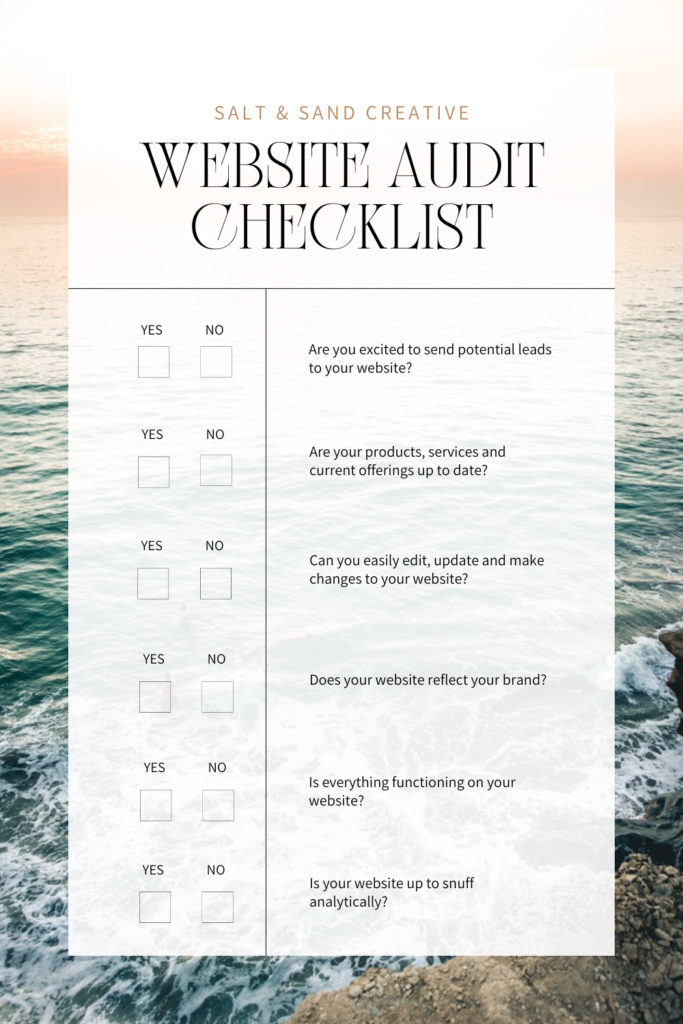
Here’s a visual checklist for ya:


Feeling a little overwhelmed with your website hosting gig and finding some blind spots in all the party prep? Let’s grab your favorite cocktail, blast some music and fix this shiz.
There isn’t a single website that can’t be fluffed up, re-modeled and prepped to party perfection. If you wish the answer to the above questions were different and that you had an online presence you could gladly dance home about – I’ve got you covered.
Every good hostess needs a good party planner and that’s where I come in. If you want to turn your checklist into a bunch of yes checkmarks – we can make that happen.
Whether you need a few pages bedazzled and prepped or need a whole website party revamp – there’s a package available for you.
Find your perfect match here.


Comments