Fall colors are popping up everywhere, and with the changing leaves come beautiful warm-toned elements that make our eyes do a little happy dance.
With every season, I feel the new inspiration to dive deep into nature’s colors and design a few color palettes that I think would be perfect if you plan on re-branding, refreshing, or heck even starting from scratch.
I think the fall vibe is perfect for any brand that wants to express coziness, warmth, softness, and change. Think of it like the perfect warm hug. If any of that describes your brand then the following mood boards might just be for you.
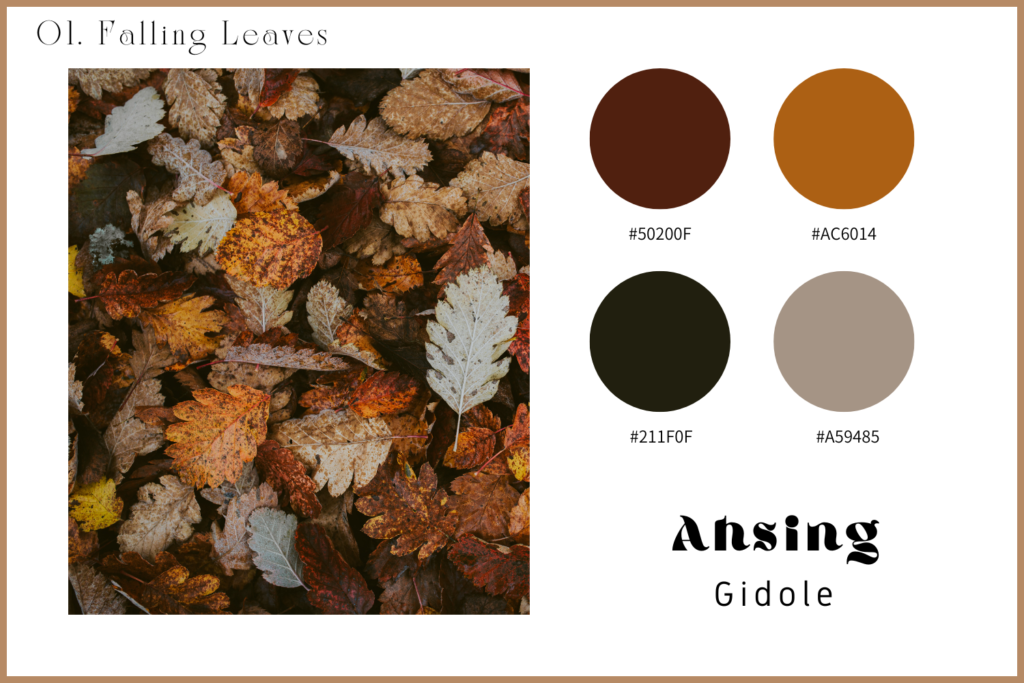
01. Falling Leaves
This palette is literally inspired by falling leaves. With the rich browns and reds and a pop of warm-toned orange this palette pairs perfectly with some chunky fun fonts. Basically, think of cozying up in your chunkiest knit sweater.
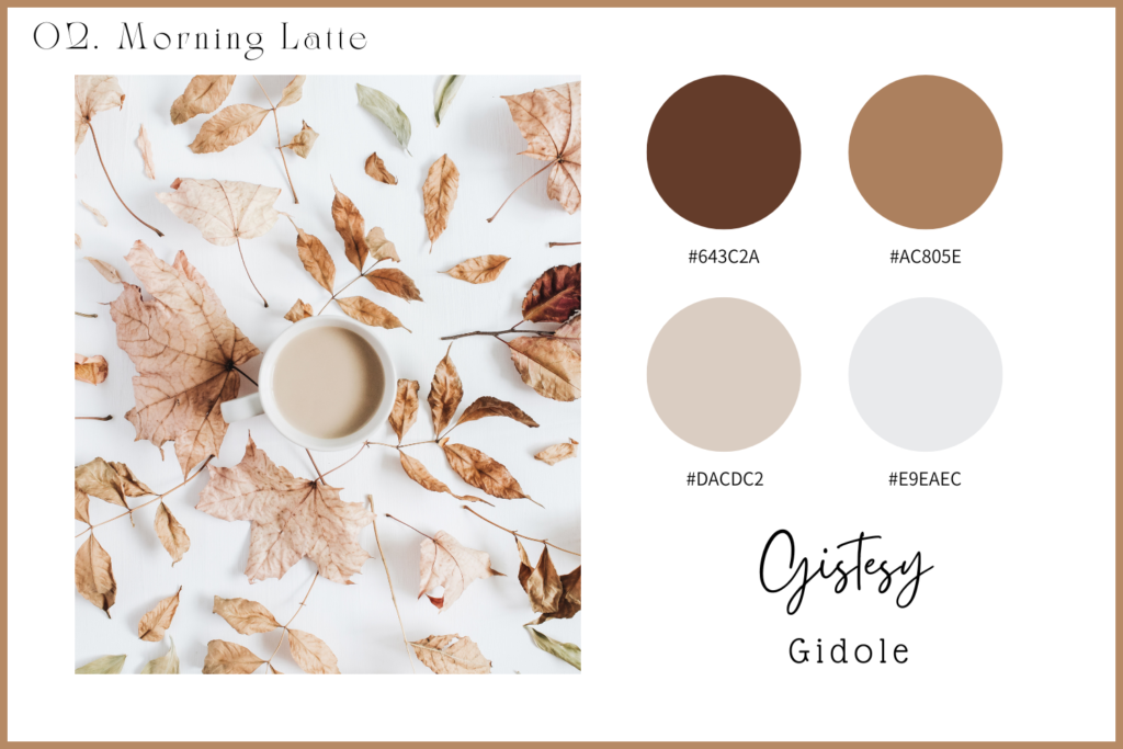
02. Morning Latte
I love this palette. It’s a more minimalistic vibe that screams light and bright yet also warm and cozy. If you desire a more minimalist brand with soft yet warm colors, this is the palette for you.
03. Rainbow Trees
Ahhhh a fun and bright-colored palette. This board is inspired by the bright colors of fall and represents all things bright, fun, and happy yet also gives that cozy vibe we long for in the autumn season. If you want something warm but also bright and fun – this might just be the inspiration you’ve been looking for.

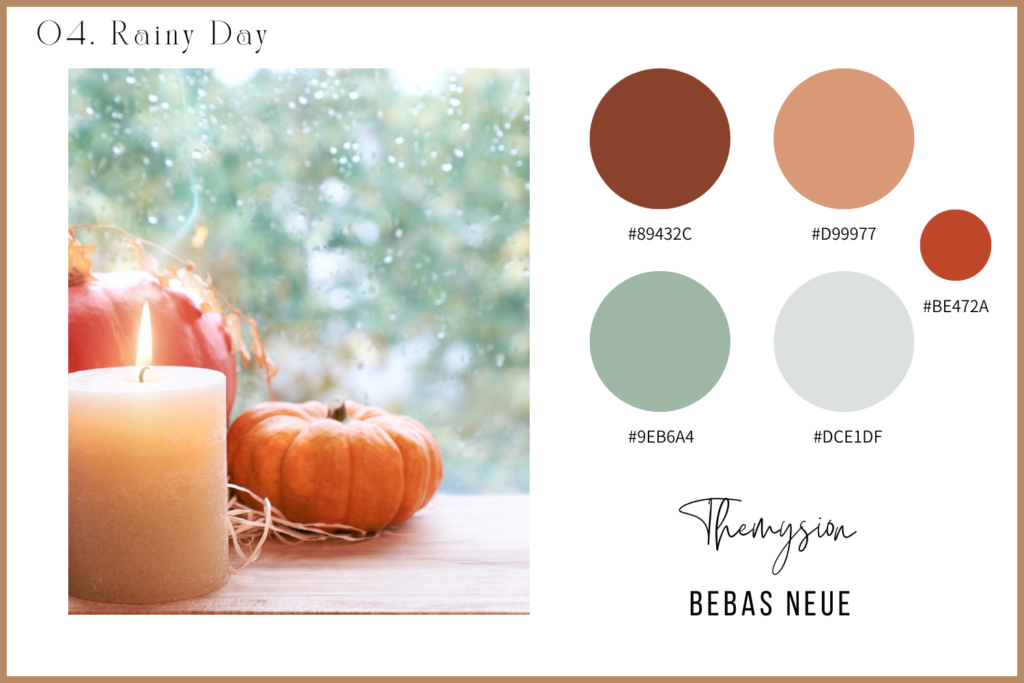
04. Rainy Day
A perfect rainy day where you can light a candle and read your favorite novel – is exactly what this palette is all about. It screams rest and relaxation with a cozy, warm vibe. I love this for a wellness brand or spa or anything that really caters to a relaxing, carefree service/product.
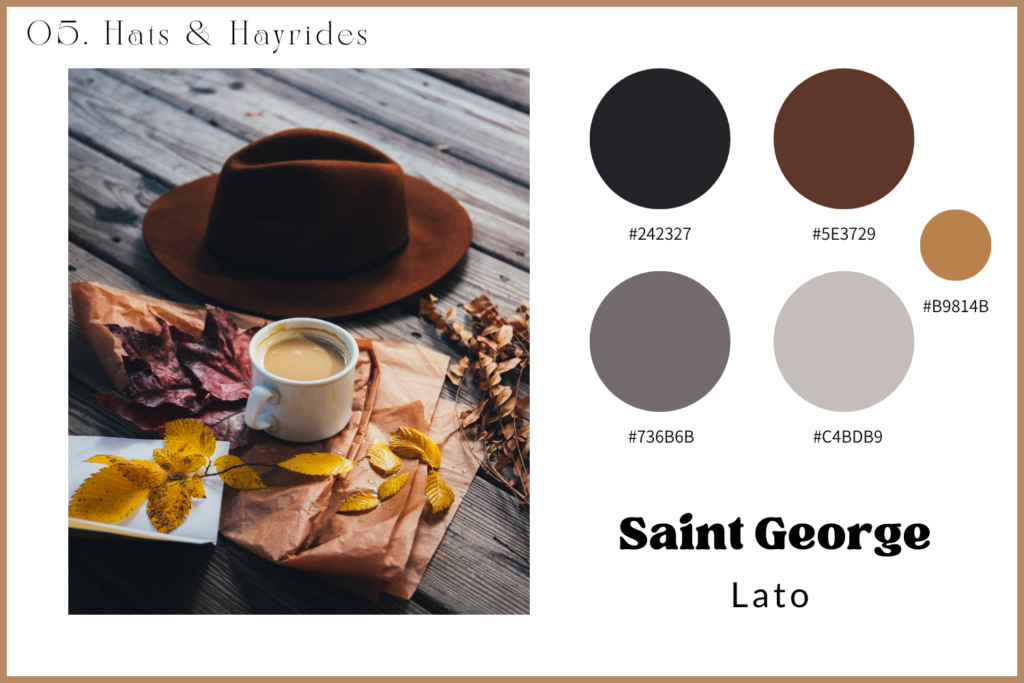
05. Hats & Hayrides
The most masculine palette of the bunch but don’t think it’s not made for feminine brands. This screams luxury, and power without feeling overpowering or intimidating. It’s a bold vibe but still has the “warm hug” feel and is perfect for an editorial-style brand or any type of luxury vibe.
Fall gives us designers so much inspiration and I think it’s one of my favorite seasons to look for inspiration when I start working with new clients on their websites. There’s just something about all the cozy, warm colors that make anyone want to stop and spend time soaking in your brand.
If you are looking for a new look and want to re-vamp your website design or copy, I’ve got some spots open just for you. Sometimes we just need someone to pull the vision out of our heads and bring it to life and that’s exactly what I am passionate about doing for others.
Check out my services here and let’s see how we can bring your brand back to life.


Comments